Fractals of Rhetoric
Working Work with us
FoR Logo
InstagramBehanceLinkedIn

Designed by FoR, developed by Unforma Club.
Typefaces use Legitima and Calluna Sans.

PT. Aksioma Retorika, perusahaan desain terdaftar Bandung, Indonesia.

About
Approach
Contact
Services
Project - Braga Bakkerij 01

Menyulam Rasa: The Branding Journey of Braga Bakkerij

How a Dutch-Indonesian bakery on Braga Street found its identity by refusing to choose a side

Industry

Food & Beverage

Services

RnD, Product Development, Brand Visual Identity, Art Direction, Custom Typography, EGD, Spatial Graphics, Prints & Production, Verbal Identity, Brand Identity Guideline, Activations

Tags

Branding, Case Study Cultural Research, Identity Design, Indonesia F&B

Year

2025–2026

Project - Braga Bakkerij 02

There is a particular kind of risk that comes with opening a Dutch bakery in Indonesia. Say it wrong, and you become a nostalgia act, a small monument to colonial longing dressed up in windmill motifs and tulip wallpaper. Say it right, and you become something else entirely: proof that two histories can sit at the same table without either one apologizing for being there.
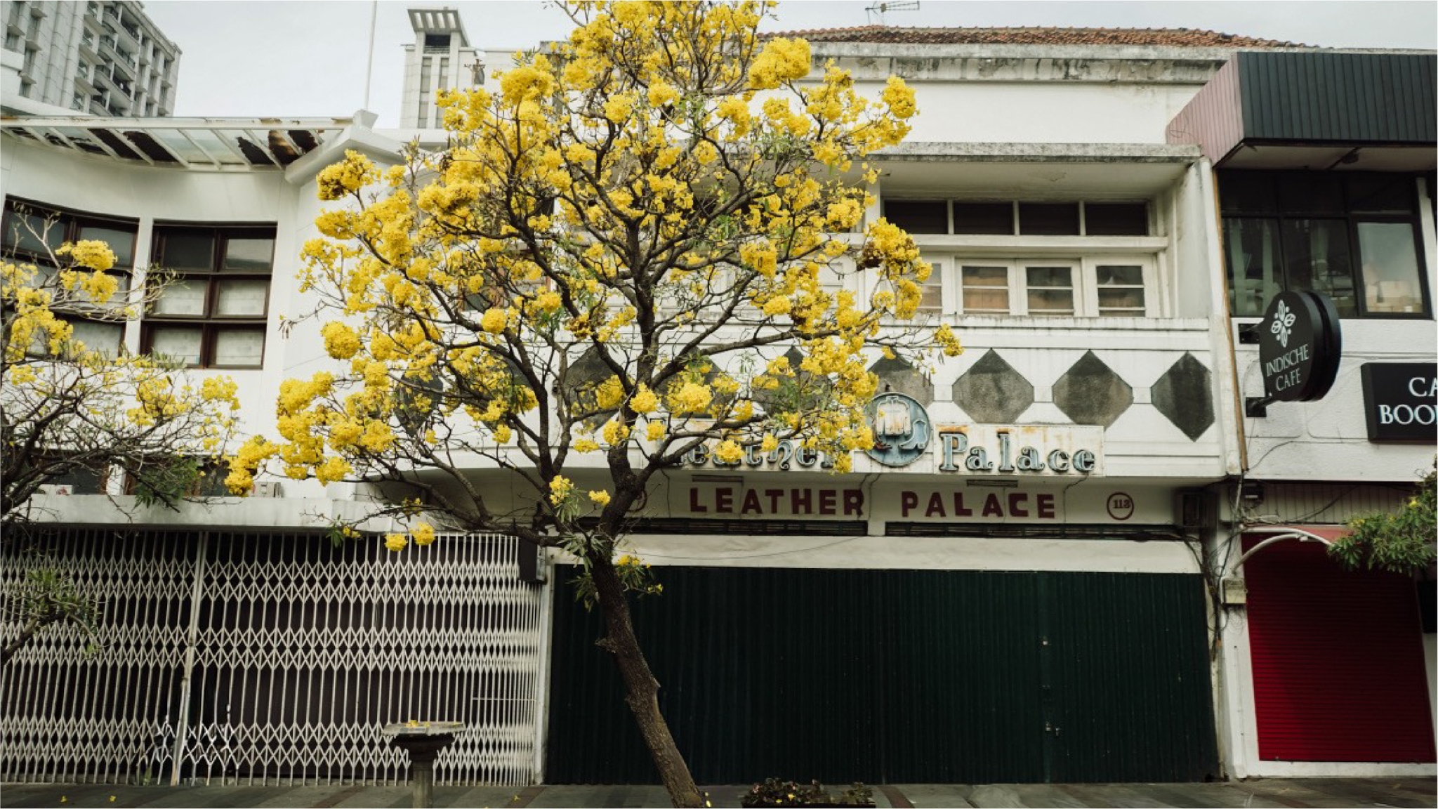
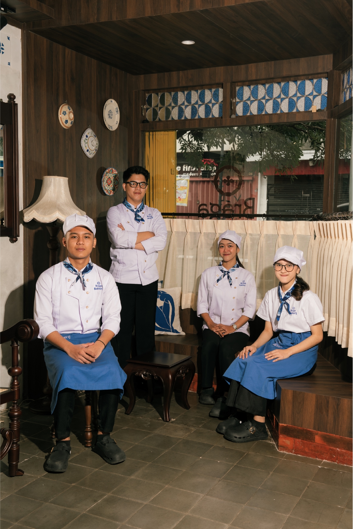
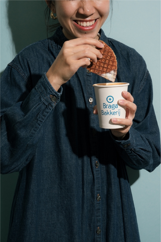
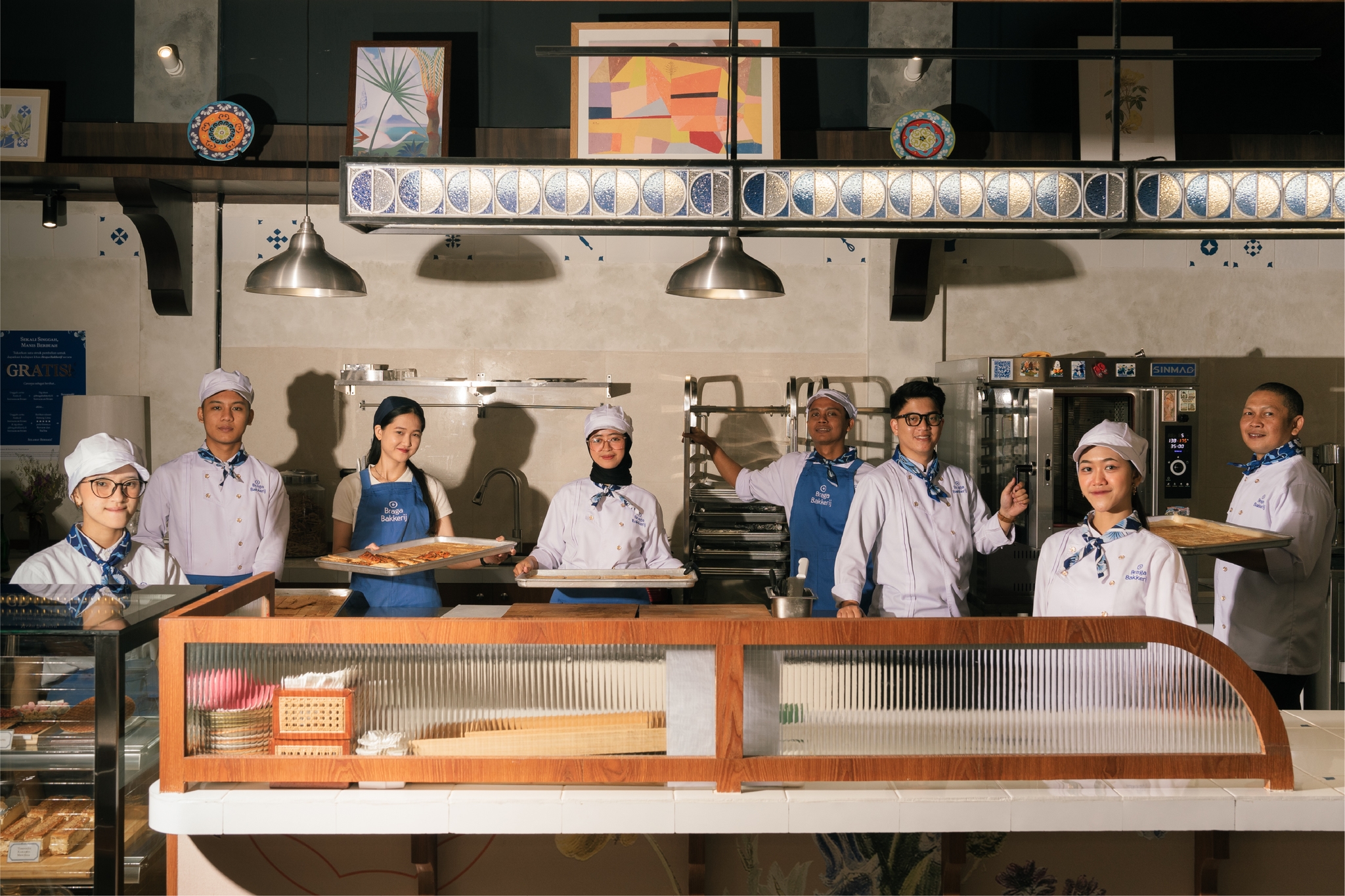
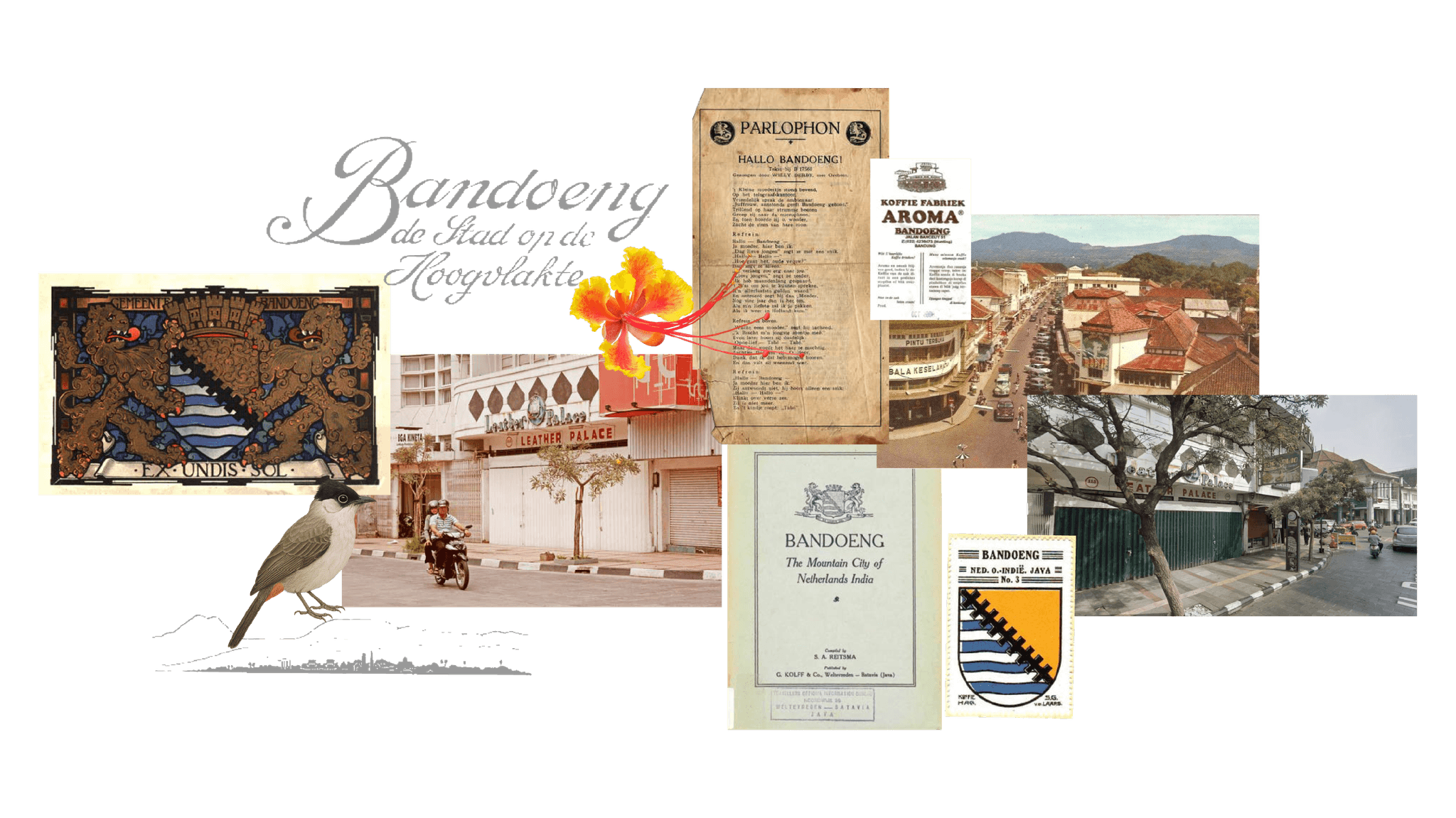
Braga Bakkerij, sited at Jalan Braga No. 113 in Bandung, chose the harder path. For urban explorers, cultural enthusiasts, and curious taste-seekers in Bandung and beyond, it positions itself as a Dutch-Indonesian bakery that reinterprets heritage recipes through local ingredients and contemporary Indonesian sensibility, built on the belief that rasa is not just flavor, it is memory, encounter, and identity woven across cultures.

The brand identity work did not start with a logo brief. It started with a question that most F&B branding never bothers to ask: what does it actually mean to sell bread that belongs to two countries at once?

Project - Braga Bakkerij 03
Project - Braga Bakkerij 05

Study Case

Most bakery branding starts with mood boards. This one started with John W. Berry's model of acculturation strategies, a framework built for psychology, not pastry. Berry's four quadrants (assimilation, separation, marginalization, integration) gave the studio a precise language for a problem that is usually handled with vague words like "fusion."

The distinction mattered. Assimilation means Indonesia disappears into Dutch form. Separation means the two never touch. Integration, the quadrant the studio anchored on, means both traditions keep their shape while genuinely changing each other.

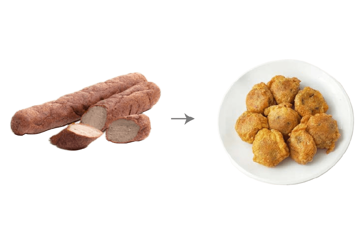
The case study they leaned on was frikadel becoming perkedel, a Dutch minced-meat patty that turned into a potato fritter on Indonesian soil, changing its base ingredient and its shape while keeping its spirit. That is not fusion as flavor gimmick. That is acculturation as lived history, and it became the brand's working definition of authenticity.

To go further, we brought in vocabulary that rarely shows up in a client deck: Walter Mignolo's epistemic disobedience and Arturo Escobar's pluriversal design, both circling the same coin of modernity and colonialism that any brand doing heritage work in a post-colonial context eventually has to touch, whether it names it or not.

From there we built a modified version of Adhi Nugraha's ATUMICS method (Artifact, Technique, Utility, Material, Concept, Shape) to interrogate each product at the level of dish, not just brand. Which parts should stay traditional. Which parts modernize. Where does the Indonesian ingredient enter and where does the Dutch technique hold.

Out of that research came what the identity calls Brand Fractals: Menyulam Rasa ("weaving taste") as belief, Pramumasak Berdikari (the self-reliant master cook) as character, and Padu Rasa Insulinde as proposition, reclaiming Insulinde, an old poetic Dutch-era name for the archipelago, as something the brand now owns rather than avoids.

Through the articulation of Menyulam Rasa as belief and Pramumasak Berdikari as character, the system ensures that every expression, naming, packaging, storytelling, and spatial graphics, moves with consistency and intention.

Project - Braga Bakkerij 08

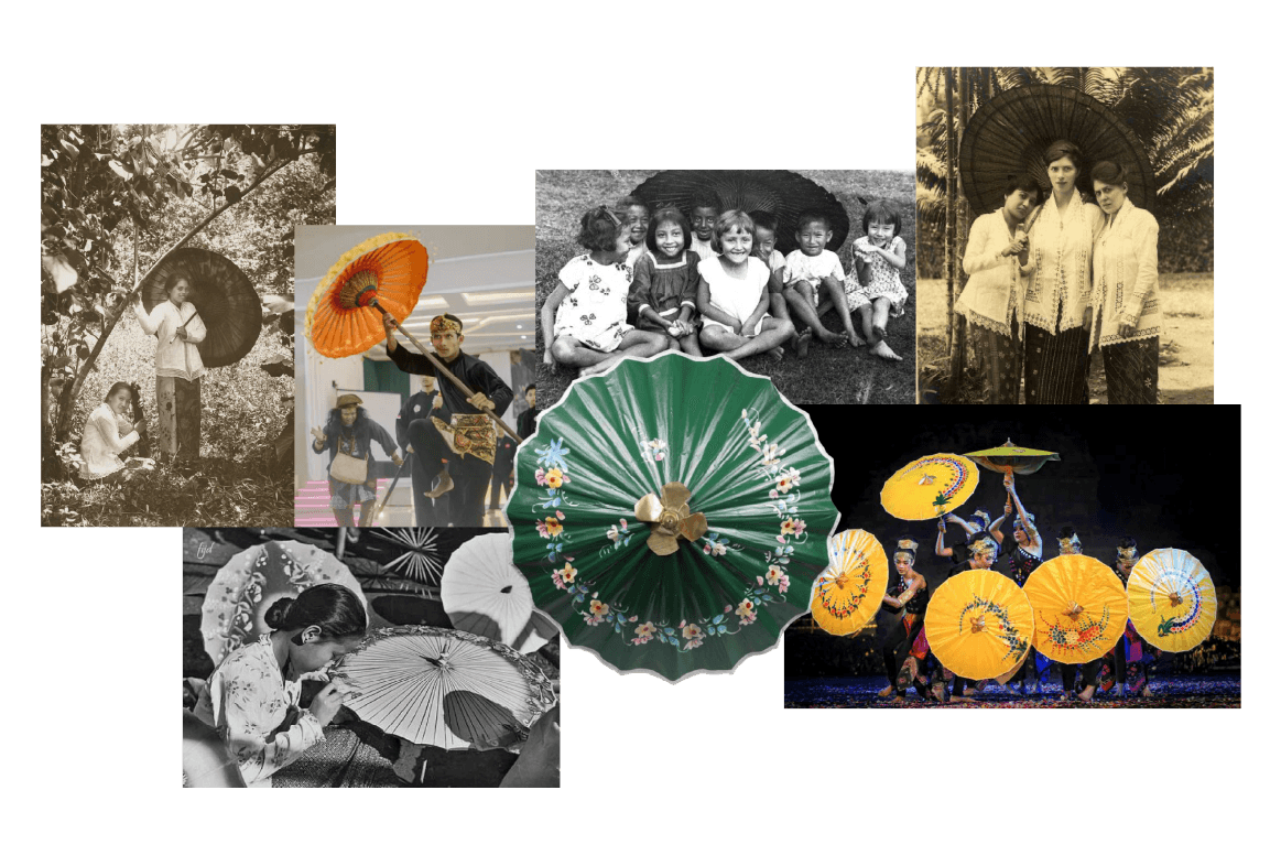
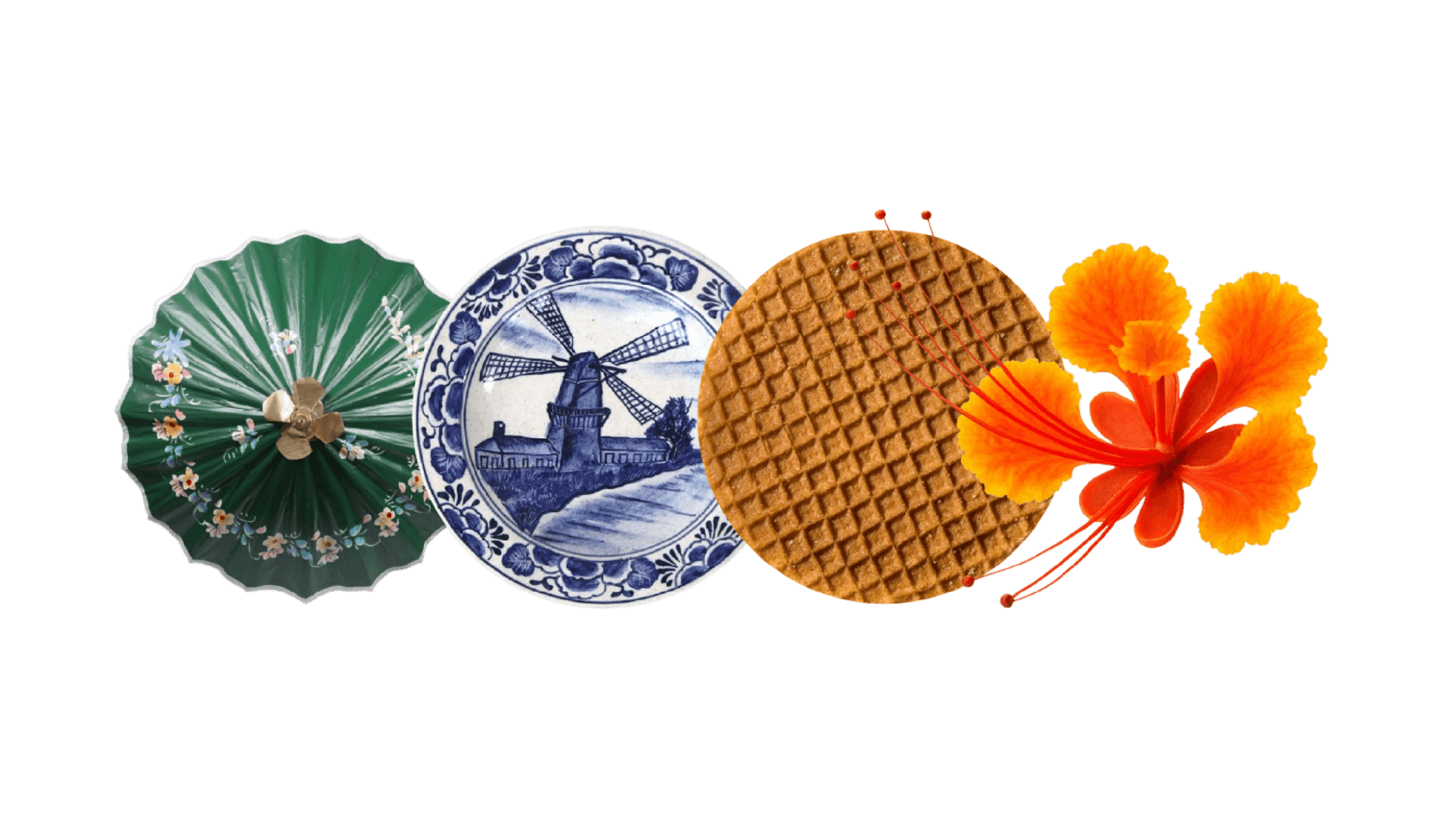
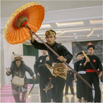
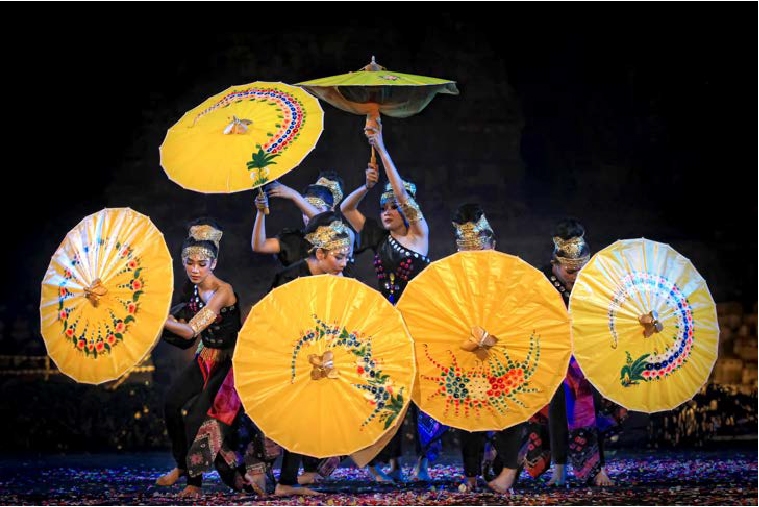
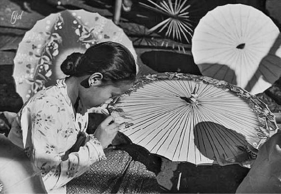
The most interesting decision in the whole project is not the wordmark. It's the choice of Payung Geulis, the hand-painted parasol native to Tasikmalaya, as the brand's symbolic anchor. It was historically carried by Dutch women in colonial Indonesia (referred to as noni) as much as by local Sundanese women, a genuinely shared object rather than an imported or imposed one, and it kept adapting, from sun protection to wedding ritual object to dance prop to tourist souvenir, without losing its core form.

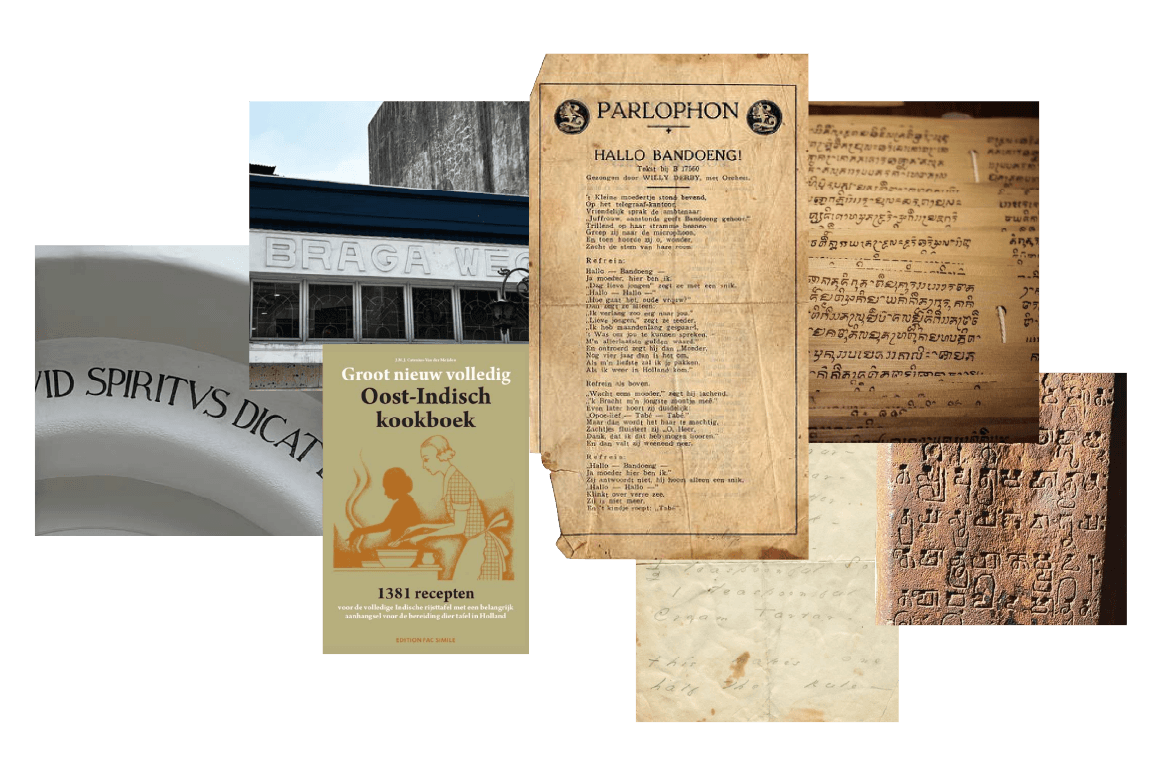
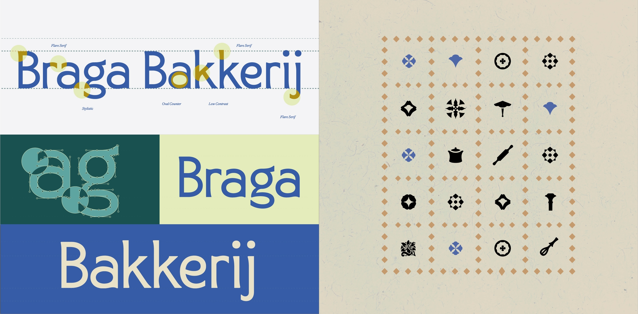
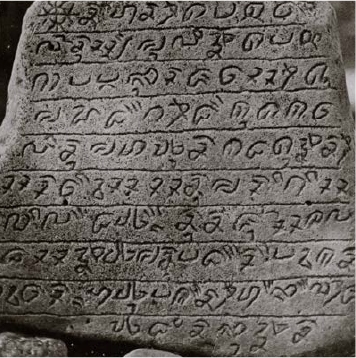
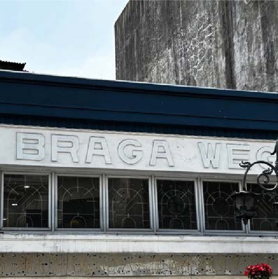
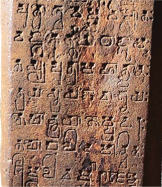
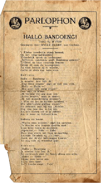
The typeface direction makes the same argument in a different register. We paired Dutch and colonial Art Deco lettering found on Bandung's heritage buildings, classic, all-caps, geometric, with the curvy, humanist letterforms found in Sundanese stone inscriptions like Prasasti Kawali, engraved by hand with a stylus called pangerupak.

Neither reference wins outright. The final wordmark carries a low-contrast, oval-countered serif with flared terminals, structurally closer to the Art Deco lineage but softened with the rounder warmth of the Sundanese engraving tradition.

Project - Braga Bakkerij 09
Hero Approach

News
In rhetorics

A Decade of Identity Work Recognised — Looking Back Without Looking Away

Is a bla bla bla...
Read More
Project - Braga Bakkerij 10
Project - Braga Bakkerij 11
Project - Braga Bakkerij 12
Project - Braga Bakkerij 13

Impact

Project - Braga Bakkerij 14

Insight

Strip away the theory and what's left is a rare thing in Indonesian F&B branding: a hybrid identity that was actually earned through research rather than asserted through a mood board. The name, the positioning statement, the parasol symbol, the typeface logic, all of it traces back to the same acculturation framework established in phase one. Nothing was bolted on for aesthetic effect.

Project - Braga Bakkerij 16

It's worth naming the tension honestly, too. Decolonial theory built for critiquing power structures, repurposed to sell stroopwafels, is a strange marriage. A cynic would call it dressing up a commercial fusion concept in academic legitimacy.

That discipline is also the project's real risk going forward. A brand built this conceptually dense has to keep its execution simple enough that a customer buying stroopwafel on Braga Street on a Tuesday afternoon doesn't need to read a thesis to feel.

Project - Braga Bakkerij 17
Project - Braga Bakkerij 18
Project - Braga Bakkerij 19
Project - Braga Bakkerij 20

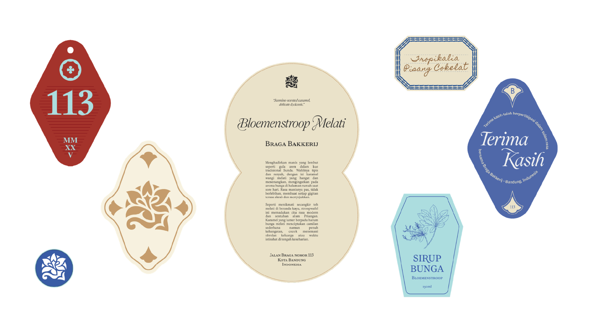
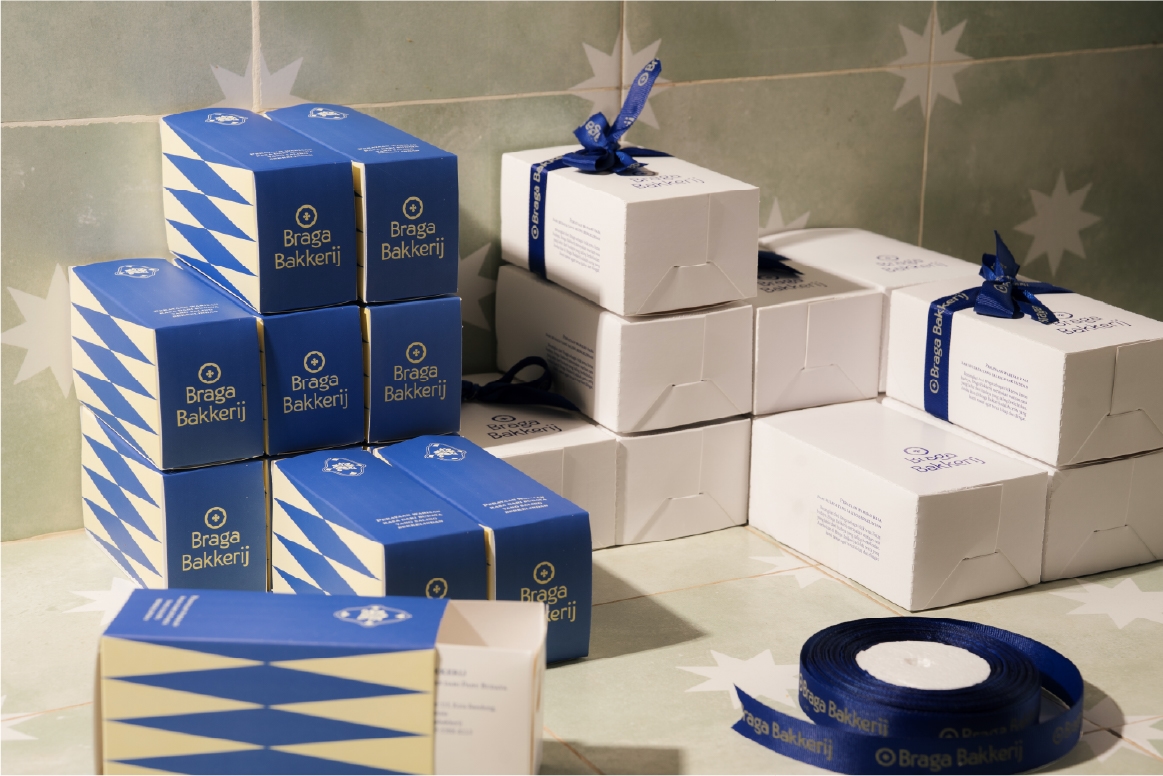
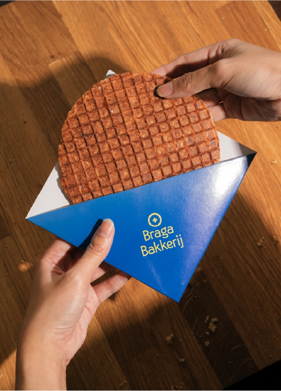
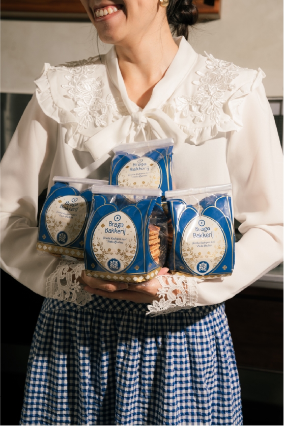
The parasol has to just look beautiful on packaging before it gets to be a decolonial argument. Judging by the applications developed so far, from product labels to tote bags to gift boxes, we seem to know this, and kept the theory in the workshop while letting the shelf-facing identity stay warm, tactile, and legible.

Project - Braga Bakkerij 21
Project - Braga Bakkerij 22
Project - Braga Bakkerij 23
Project - Braga Bakkerij 24
Project - Braga Bakkerij 25

Refractions

Project - Braga Bakkerij 26

Traditional type example in Mulawarman (Kalimantan) and Prasasti Astana Gede atau Prasasti Kawali (Ciamis). Made by pangerupak or engraving stylus shown a curvy, humanist characteristic.
Project - Braga Bakkerij 27
Project - Braga Bakkerij 28
Project - Braga Bakkerij 29

A combination of Dutch-originated typography and Indonesian adaptations of the classic, bold, and charismatic serif typeface. Combined with letter gestures, with a handwritten style with a personal pramumasak character

Project - Braga Bakkerij 30

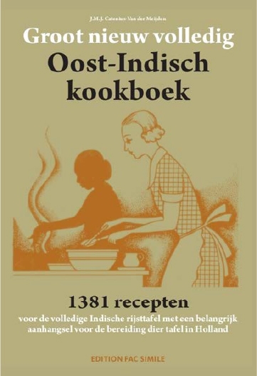
One of the famous ones is Nieuw Volledig Oost-Indisch kookboek 1902 by J.M.J. Catenius van der Meijden (1925)

Project - Braga Bakkerij 31

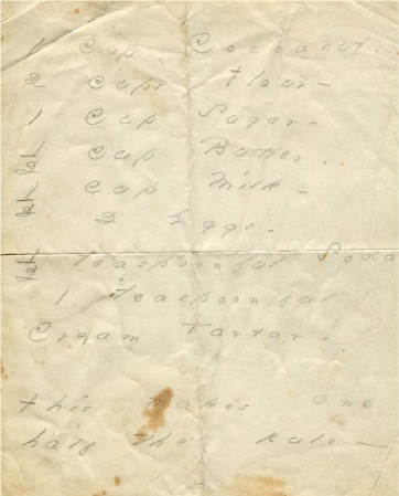
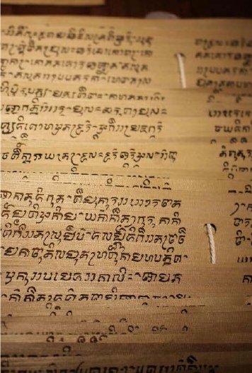
A variety of cooking recipes recorded in the Sanghyang Siksa Kandang Karesian manuscript, translated by Salah Danasasmita, et al (1987)

Project - Braga Bakkerij 32
Project - Braga Bakkerij 33

Typography work around Art Deco buildings in Bandung, created by the Dutch during the colonial era. Type emphasis on classic, all caps, and geometric.
Project - Braga Bakkerij 34

Prosesi Mapag dalam tradisi pernikahan Sunda yang disebut Payung Agung.
Project - Braga Bakkerij 35

Pertunjukan tarian Payung di Festival Payung 2019 dihelat di candi Prambanan.
Project - Braga Bakkerij 36

Pengrajin Payung Geulis, Tasikmalaya.
Project - Braga Bakkerij 37

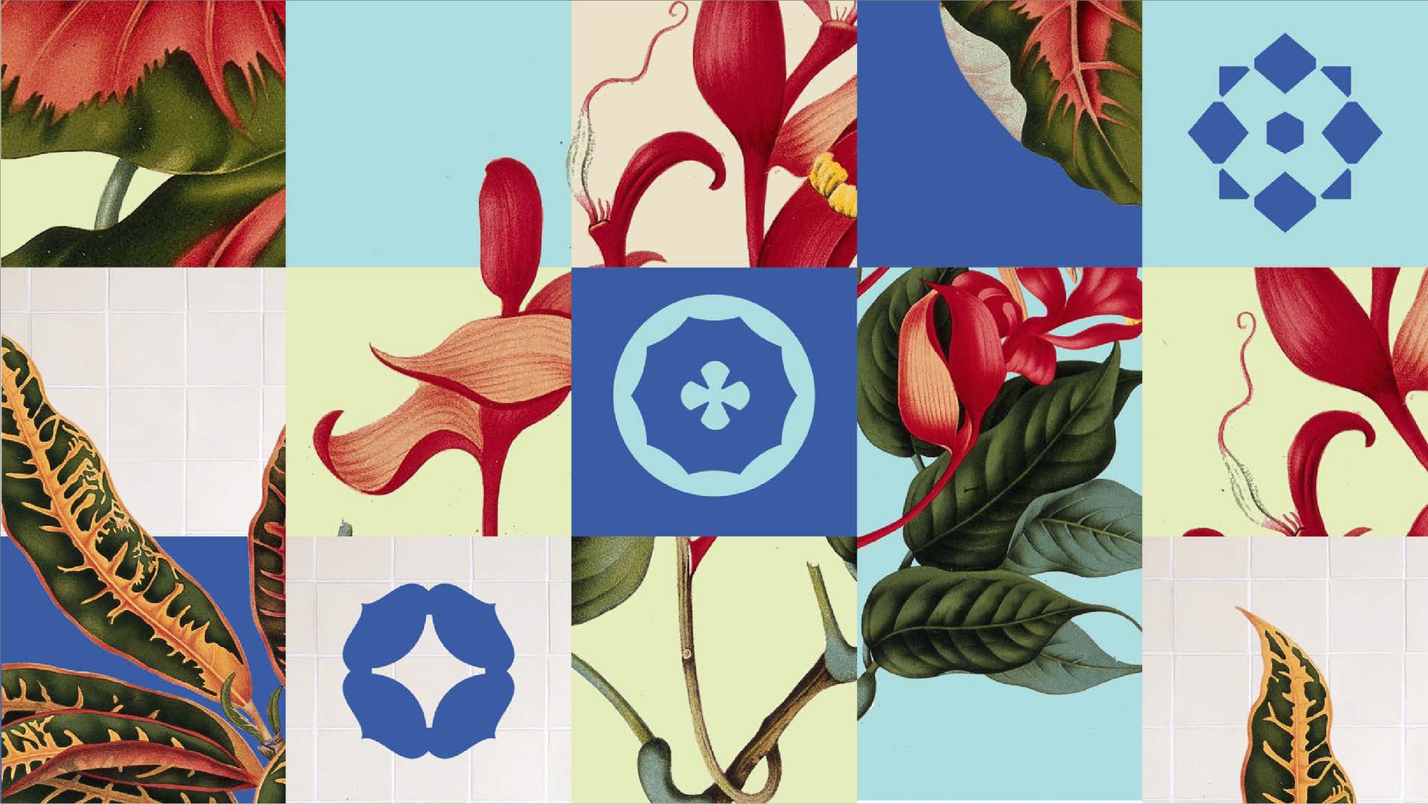
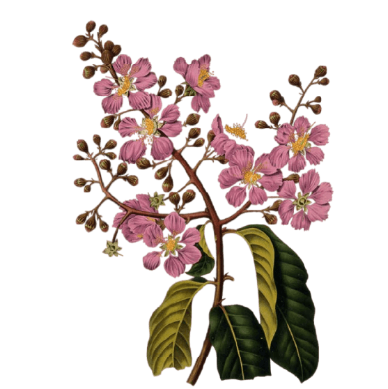
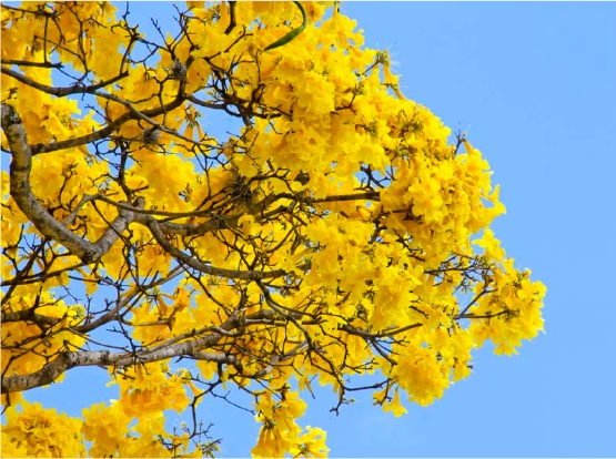
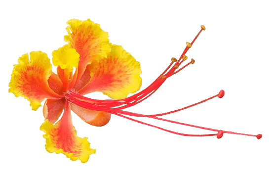
Queen flower or Pyinma

Project - Braga Bakkerij 38

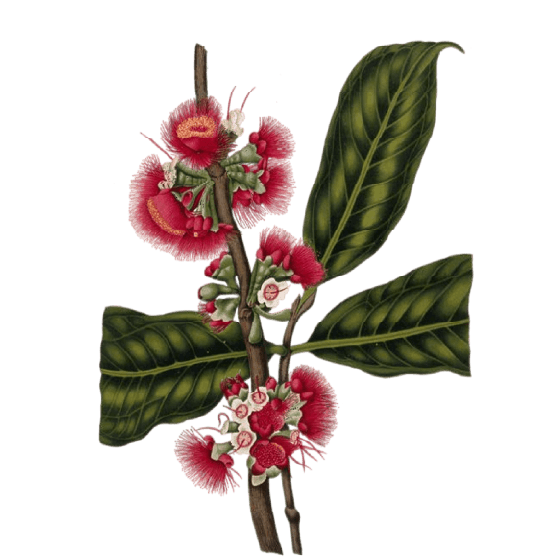
Rose Apple

Project - Braga Bakkerij 39

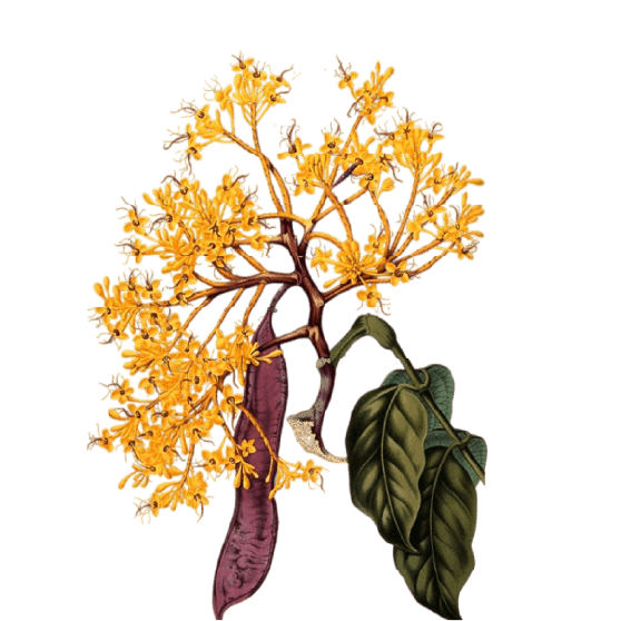
Saraca declinata

Project - Braga Bakkerij 40

Pengrajin Payung Geulis, Tasikmalaya.
Project - Braga Bakkerij 41

Queen flower or Pyinma

Project - Braga Bakkerij 42

Rose Apple

Project - Braga Bakkerij 43

Saraca declinata

Thanks to: Arief Rahman Sugandi, Dede Syaputra, Idna Fathur, Kadek Aditya Krisna Priyamana, Jejak Kurcaci, Akbar Moujahid, Billy Seizar Pratama, Amira Isni Fakhirah Walneg, Trim & Fold, Yohannes Budiman, Florentina Riri, Alif Hudanto

Symbol - About

FoR is built on the belief that the quality of thinking determines the quality of the outcome.

Every person in this practice was chosen on that basis—not for their titles, but for the depth they bring to the work and the standards they hold themselves to inside it.

Talk with us

More Projects

  • Project - Braga Bakkerij 01

    Brand Identity

    Menyulam Rasa: The Branding Journey of Braga Bakkerij 4

    Monday, 7 September 2026 by Fractals of Rhetoric

    How a Dutch-Indonesian bakery on Braga Street found its identity by refusing to choose a side

  • Project - Braga Bakkerij 01

    Brand Identity

    Menyulam Rasa: The Branding Journey of Braga Bakkerij 3

    Monday, 7 September 2026 by Fractals of Rhetoric

    How a Dutch-Indonesian bakery on Braga Street found its identity by refusing to choose a side

  • Project - Braga Bakkerij 01

    Brand Identity

    Menyulam Rasa: The Branding Journey of Braga Bakkerij 2

    Monday, 7 September 2026 by Fractals of Rhetoric

    How a Dutch-Indonesian bakery on Braga Street found its identity by refusing to choose a side

  • Project - Braga Bakkerij 01

    Brand Identity

    Menyulam Rasa: The Branding Journey of Braga Bakkerij

    Monday, 7 September 2026 by Fractals of Rhetoric

    How a Dutch-Indonesian bakery on Braga Street found its identity by refusing to choose a side

  • Show All